BRIEF: To make zerowastenear.me the 'go-to' brand for everyone to become more sustainable shoppers, making a significant change for the planet and their wallets.
Concept work for a student project.
DEMOGRAPHIC: Young families, who are perhaps already environmentally conscious.
BIG IDEA: zerowastenear.me will be your leading source of information to enjoy your summer guilt free and helping the planet.
SKILLS:
concept development
branding
illustration
typography
hand-lettering
microsite
wireframing
campaign
photo manipulation


zerowastenear.me is a website which acts as a directory of all the zero waste shops in your local area. For this campaign I wanted to make people aware of this resource. For example, millennials with children who are aware of the impact of their shopping choices, but don't know of other places to shop plastic free. They are the generation of Netflix, and may feel guilty of all the plastic wrappers that are left over at the end of a movie night. Or they like to go on picnics with their kids, but everything is prepackaged and it weighs on their conscious. This campaign will encourage them to have a sin free movie night, or have plastic free picnics, so they are no longer guilty pleasures!
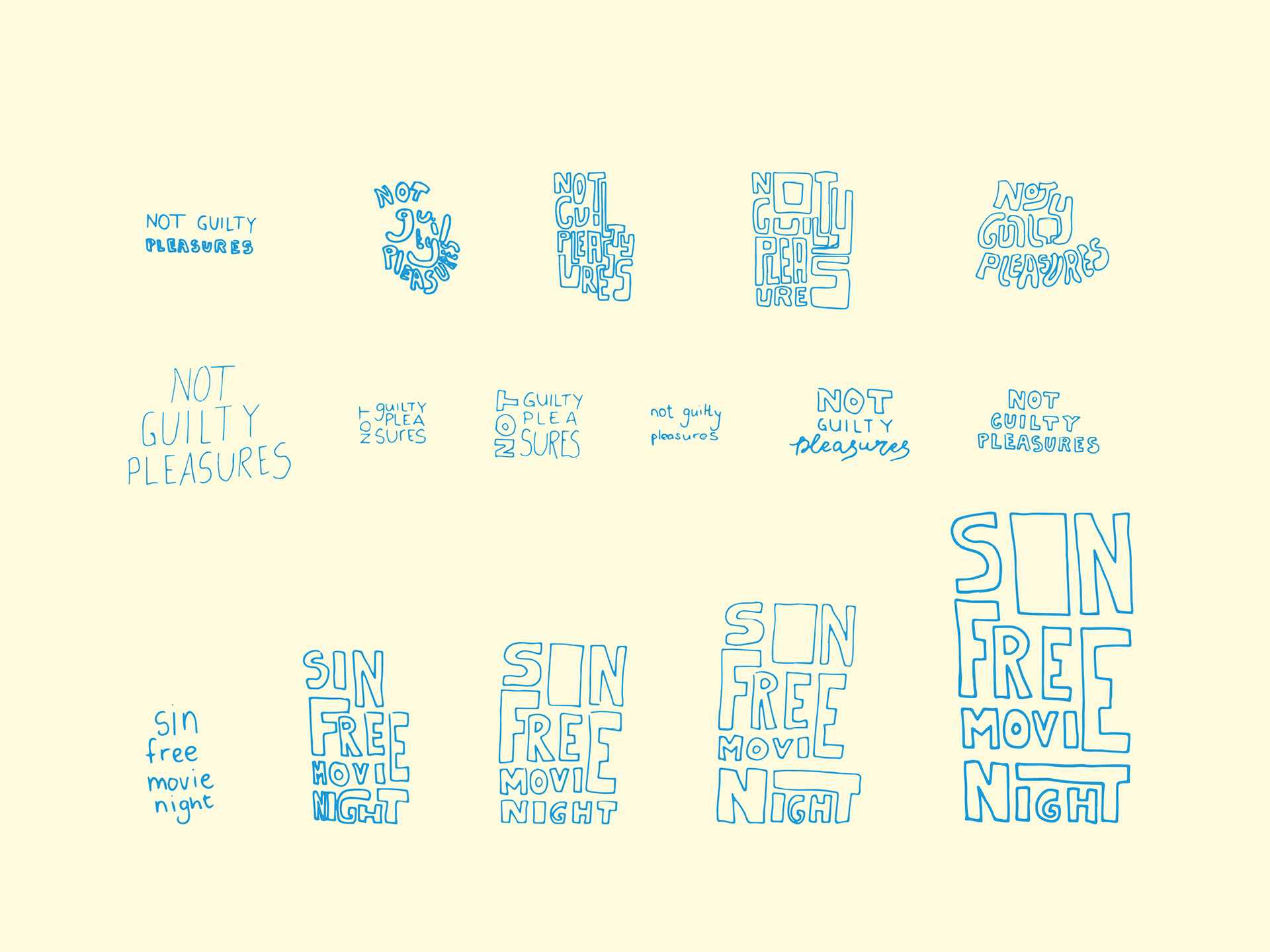
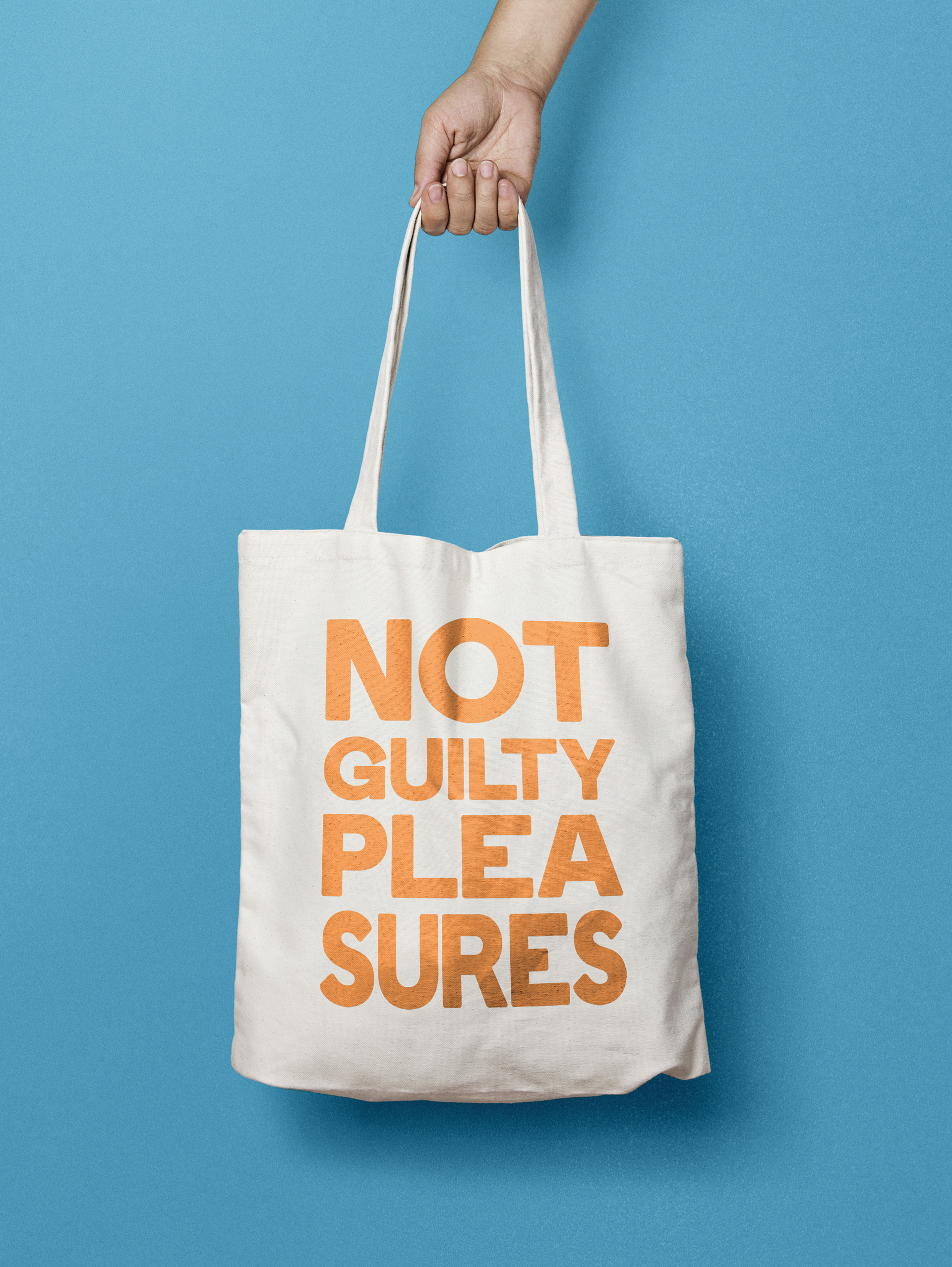
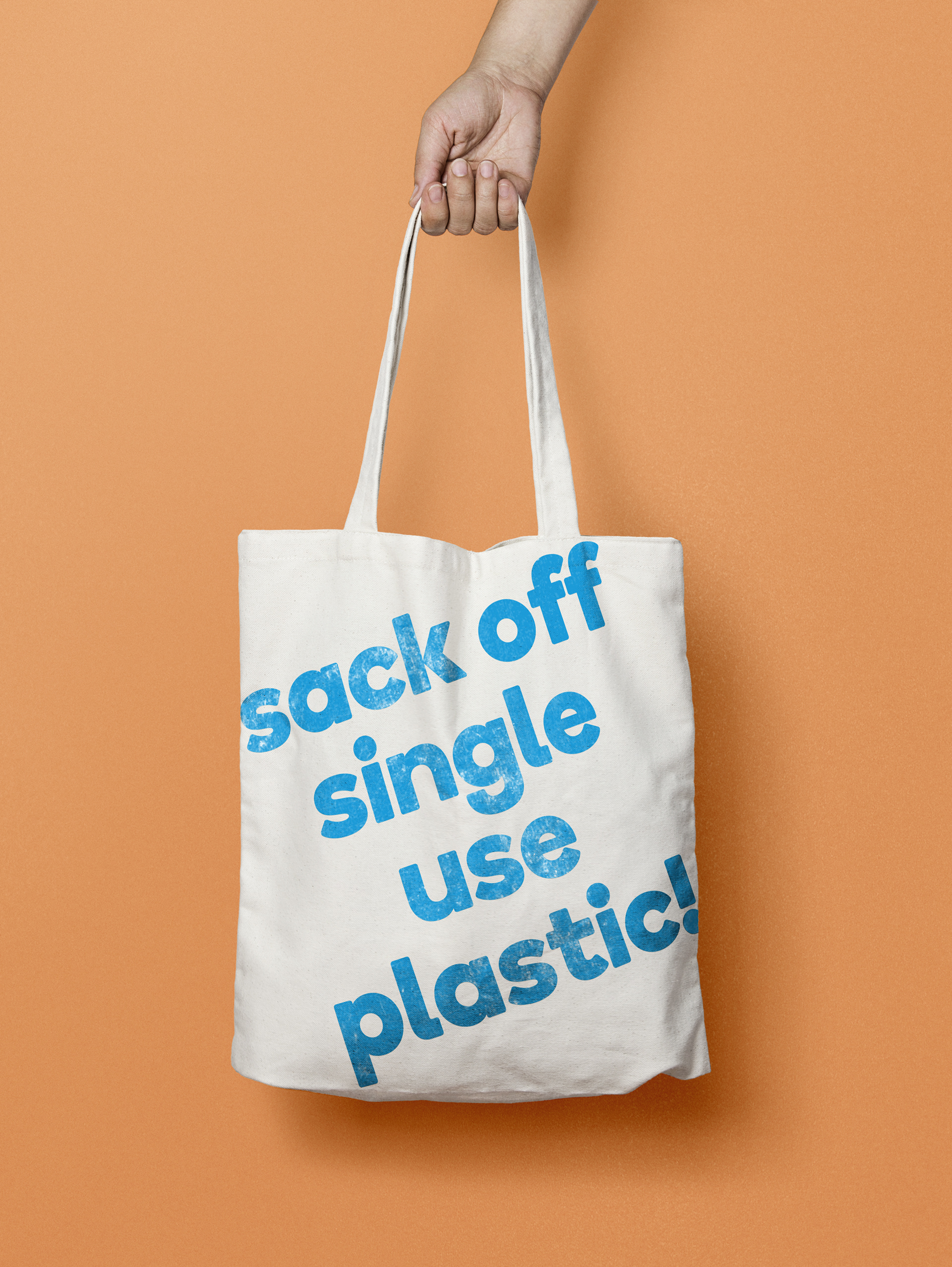
I wanted to create a friendly non-judgemental feeling with this campaign, so I created a hand-lettered type lockup and illustrations, with earthy textures and an uplifting colour pallete.


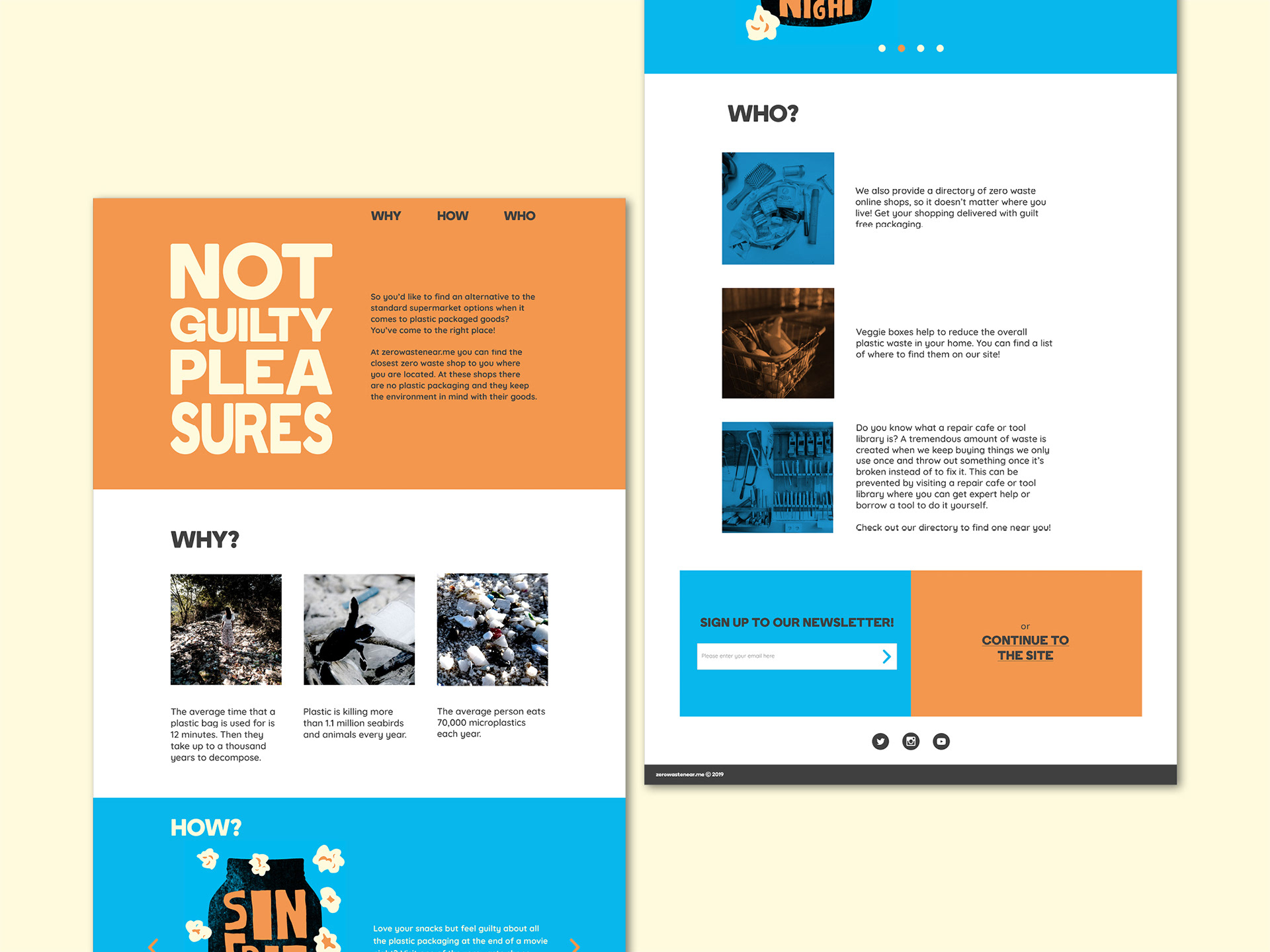
The campaign landing page informs people and tells them of all the resources to be found on the site, which they can click through to, or sign up for the newsletter to get more tips and tricks for shopping with the environment in mind.
